
Tuesday, December 13, 2011
Thursday, December 8, 2011


Tuesday, December 6, 2011
Concept
The creation of a linear gallery based on the tectonics and pattern of the inverse model of an image of bamboo poses the challenge of interpreting the media at different scales. I have analyzed the individual pieces of the original model, and I have abstracted the knuckle on the bamboo pieces so that it is an interpretation of two cylindrical parts colliding, and that force of collision creates a buckling so that the materials break away from the original form creating a greater circumference at the location of collision. I have used this concept to develop a parti that expresses a collision of two linear aspects that meet and then diverge because of the implied friction created by the act of colliding. In a literal sense, there are two linear galleries that collide, and on section slides underground, whereas the other is pushed upwards. In terms of the scale of the entire inverse model, the cylindrical tubes can be used as a screening system across the skin of the gallery. The screen can be selectively omitted in places to allow for a rhythm on the façade and to allow for more light to get in the gallery at opportune locations.


Tuesday, November 29, 2011
Exercise 10

For this exercise, I created several iterations for the logo of the Linear Gallery of the Architecture building. Most of the iterations stem from an abstraction of a plan view of the bays of the gallery.I have used squares to represent the bays and aligned them either vertically or horizontally and changed the text to achieve different effects. Later iterations (right) start to develop a three dimensional interpretation of the space with, either overlapping transparent rectangles, or solid blocks.
Tuesday, November 22, 2011

Exercise 9

Thursday, November 10, 2011
Exercise 8
For this exercise, I took the image of a texture (bamboo stalks) and a space (Frank Gehry's Guggenheim Museum) and abstractly modeled them on Form-Z. The bamboo is broken up into three layers: the stalks, the connection pieces, and small tubes of white that represent the highlights on the texture of the bamboo on the original photo. The museum space is broken up into the transparent background with an abstraction of mullions, curvy walls that stretch up to the ceiling, and solid cylinders that represent the walls that meet the ground plane. In both sets of images, the natural light provides little contrast. The spotlights are located within the models and therefore create a different sense of depth. The hybrid lighting conditions have a greater sense of contrast.


Thursday, November 3, 2011
Portfolio Intentions
While creating the layouts for the portfolio spreads and resume, it was my intention to create a grid of datum lines that can be utilized throughout the portfolio. The grid consists of a bar on the top that can house the title, process models, diagrams, etc. The bar allows for a progression of ideas to flow from page to page. There is a bar on the bottom as well, and this bar can house grounded images such as elevations or sections. The center is split into two columns. These areas can be combined to create more hierarchical areas.


Thursday, October 27, 2011
Exercise 7
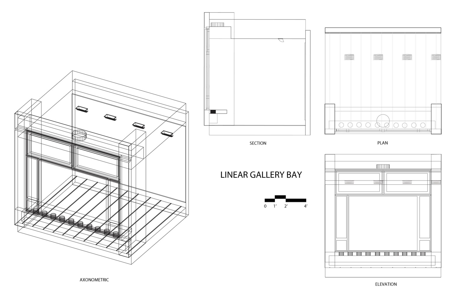
For this exercise I further developed my skills in Form Z by creating a realistic model of a bay in the linear gallery of the architecture school. My intentions for the perspective were to give the model a human scale by adding scale figures, show that the bay is repeated in the linear gallery by shrinking the perspective and repeating it along the axis of the gallery, and show the context of the gallery by showing the relationship of the room with the exterior.

Thursday, October 13, 2011
Project 1 final

Monday, October 10, 2011
Exercise 6
For the exercise, I have edited the previous project. First, I spread the O towers apart so that the viewer can understand the space in between the model. The model deteriorates into hidden frame instead of the less clear wireframe. A ghosted close-up perspective is on the right and on top is the progression from the base letter to the pattern. Light dashed lines connect a series of the base letters so that the rhythm of the progression is clear.

Tuesday, October 4, 2011
Exercise 5
For this exercise, I continued to show the symmetrical quality of the letter O by breaking the letter into two equal parts and rotating them. Still using the 2d pattern created on illustrator, I created a different 3d pattern than the last exercise. This new model better shows the rotational quality of parts of the letter because they spiral up and around the base form, which is highlighted in orange. The bottom of the model disintegrates into the wireframe, revealing the spiral on which the part is rotated. On the left side of the image, is a series of images that show the process of creating the form, starting with the letter, moving to the pattern, then the model.

Tuesday, September 27, 2011
axon rendered 2
 Using the O pattern created on Illustrator, which focused on the rotation of parts that create a new letter on the stress line, I have emphasized the negative space by making it a solid figure. In the center of the plane, I have created hierarchy by building a single figure of the original base. The second iteration focuses on the juxtaposition of the positive and negative space and how the two entities connect.


Tuesday, September 20, 2011
Pattern 1 exercise 3

Pattern 2 Exercise 3

Tuesday, September 13, 2011
miller_gothicanalysis_2

miller_gothicanalysis_1

Tuesday, September 6, 2011


Sunday, September 4, 2011


Subscribe to:
Comments (Atom)