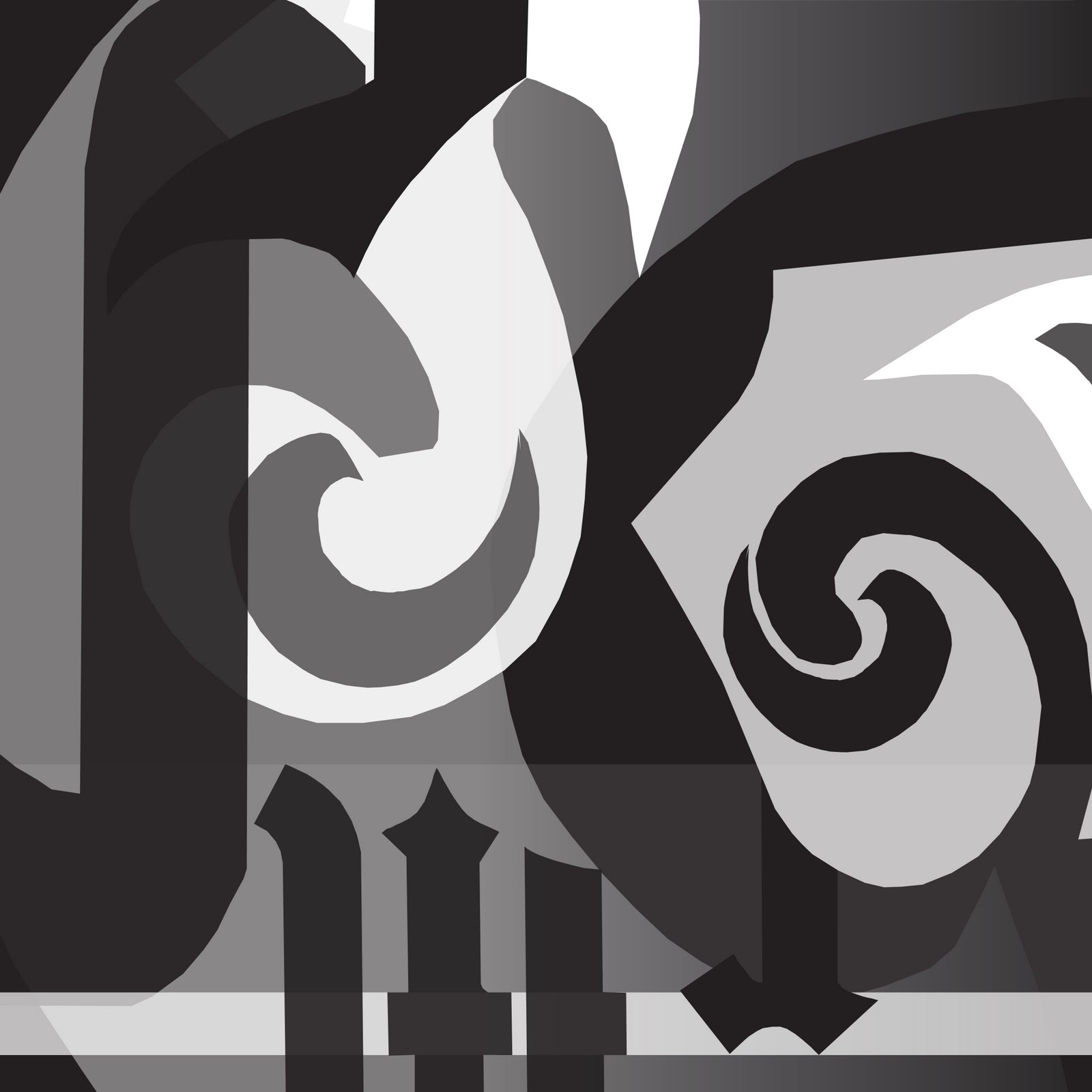
This image is an analysis of the gothic typeface of the Grand Marnier font. The graphics display and compare the bulbous nature of the loops, ears, and serifs of the font. For example, the ear of the lower case A and the loopy nature of the lowercase E are displayed across from each other, in a battle between figure and ground. Within these large blowups of the A and E are smaller scaled loops from the G. This makes a comparison of the curvacious features and creates an asymmetrical composition that has similar features on either side of an axis. On the bottom of the composition is an R and and M (upside-down) with datum lines that indicate the x-height and how it is projected onto the vertical strokes of the M. This also adds a subtle linear element that contrast the overall curvy nature of the composition.
No comments:
Post a Comment