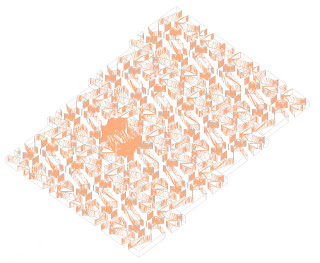
 Using the O pattern created on Illustrator, which focused on the rotation of parts that create a new letter on the stress line, I have emphasized the negative space by making it a solid figure. In the center of the plane, I have created hierarchy by building a single figure of the original base. The second iteration focuses on the juxtaposition of the positive and negative space and how the two entities connect.
 Tuesday, September 27, 2011
axon rendered 2
 Using the O pattern created on Illustrator, which focused on the rotation of parts that create a new letter on the stress line, I have emphasized the negative space by making it a solid figure. In the center of the plane, I have created hierarchy by building a single figure of the original base. The second iteration focuses on the juxtaposition of the positive and negative space and how the two entities connect.
 Tuesday, September 20, 2011
Pattern 1 exercise 3
This pattern is an analysis of the transformative process that creates the letter A and a comparison of the the rectilinear and curvilinear shapes that make up the letter. From the middle, the letter starts as a block and as it moves outward, portions are carved away until the letter stands on its own. The reflection of the transformation allows for a pattern of the negative space. However, because the composition is a line drawing, the figure and ground are up to the viewer's opinions; therefore, the aforementioned negative space can become interesting figures on the sides of the drawing.
Pattern 2 Exercise 3
For this pattern, I isolated a single letter, and split the O into two parts. The parts are rotated in a transparent layer until it completes another O below or above the original O. This analysis explores how two parts of the letter are a the same and make a complete letter after rotation. Also, the diagonal alignment of the O's is an analysis of the line of stress.
Tuesday, September 13, 2011
miller_gothicanalysis_2
This image is an analysis of the gothic typeface of the Grand Marnier font. The graphics display and compare the bulbous nature of the loops, ears, and serifs of the font. For example, the ear of the lower case A and the loopy nature of the lowercase E are displayed across from each other, in a battle between figure and ground. Within these large blowups of the A and E are smaller scaled loops from the G. This makes a comparison of the curvacious features and creates an asymmetrical composition that has similar features on either side of an axis. On the bottom of the composition is an R and and M (upside-down) with datum lines that indicate the x-height and how it is projected onto the vertical strokes of the M. This also adds a subtle linear element that contrast the overall curvy nature of the composition.
miller_gothicanalysis_1
This image is an analysis of the Gothic typeface from the Corona font. Instead of analyzing multiple features of the letters, I focused on the stress of the font. Although the vertical elements of the letters are straight up and down, the strokes connecting the vertical elements are angled, creating a stress on the letters, especially the counters of O's, A's, and G's. I started by taking a diagonal across the counter of an O, and then I aligned another letter's vertical with that diagonal. I repeated the process while scaling the letters and changing the value and opacity. The repetition of this process creates a spiral, whose tangents are the stress lines of the letters that create it.
Tuesday, September 6, 2011
Sunday, September 4, 2011
Subscribe to:
Comments (Atom)


